Cursive and Manuscript Handwriting Fonts
Logic of English Handwriting Fonts
Logic of English handwriting font:
- aids students who struggle with handwriting
- requires a minimal amount of fine-motor skill
- fosters rhythmic handwriting development
- incorporates natural hand movements with the ergonomic slant of paper
Cursive Font
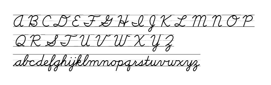
Highlights
- All lowercase letters begin on the baseline.
- Uppercase letters only connect to the following letter if they end on the baseline.
- The capital Q has been simplified to reflect the manuscript version.
- Letter formation is matched to the manuscript font to facilitate the transition to cursive.
Manuscript Font
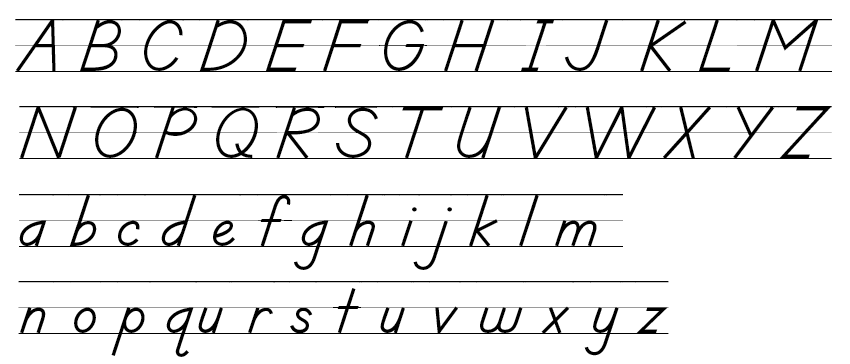
Highlights
- Most lowercase letters begin on the top line and midline to minimize the number of starting places. The exceptions are c, e, f, and t.
- Letters are formed with the minimal amount of picking up the pencil. Pencil lifts require more fine motor control and increased instruction on placing the pencil before beginning the next stroke.
- Letters are slightly slanted because of the natural slanted positioning of paper.
- Letter formation is closely matched to the cursive font to facilitate ease in transition to cursive.
- The font was modeled after the D'Nealian handwriting style; however, Logic of English updated the font to ensure developmentally appropriate handwriting instruction.